Tring Brewery Gets a Great New Look
Tring Brewery is launching a new look for its beers today using applied colour psychology which recognises the importance of colour in influencing emotion, mood and behaviours.
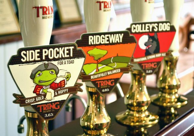
The brewery is initially starting with a new look for its pump clips – unifying the style across the range of beers and looking to increase its appeal to both new and existing customers.
Ben Marston, Tring’s Marketing manager, said:
Kate Marston, KM Design founder, initially looked to identify one of four main personality groups that best represented the brewery and its beers. Once complete, a specific colour palette was selected and from this the design team were able to begin to selecting the final range of colours called Firelight (also known as the autumn group).
Firelight uses warm, comforting tones and avoids harsh black and white. Kate added,
“You cannot underestimate the importance of colour and that if you get this wrong your customers feel uneasy even if they can’t put their finger on why this is.”
Tring’s pumpclips have moved away from its distinctive triangle and now use a shield shape. However this is a subtle change in shape and one that will hopefully avoid consumer confusion. Kate has included triangles within the design as this reflects the heritage of the brewery which was originally located in the historic area of Tring known as the Tring Triangle.
Comments are closed.